
Why Every Great Website Starts with a System, Not a Style
In the world of digital design, there’s a common mistake that slows teams down, breaks consistency, and weakens user experience — starting with visuals instead of structure.
At Koadz, we believe in a simple but powerful principle:
Design is not decoration. Design is structure.
Before colors, animations, illustrations, and aesthetics come into play, the foundation must be built. And that foundation is the grid system.
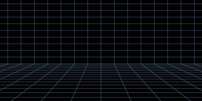
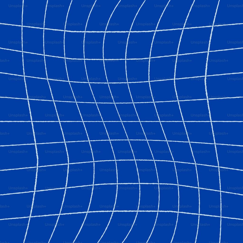
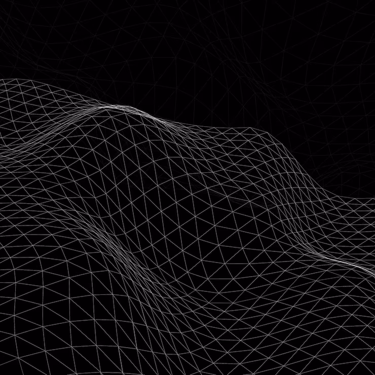
The Invisible Framework That Powers Great Design
A grid is more than just lines on a canvas—it’s an invisible framework that quietly guides content placement, alignment, spacing, visual hierarchy, consistency across pages, and responsiveness across devices. Grids don’t limit creativity—they liberate it, because when structure is clear, creativity flows faster and ideas can move freely without chaos.
Why Grids Come Before Design Decisions
Most design problems are actually structure problems. When designers skip structure, they end up with inconsistent layouts, poor alignment, confusing navigation, visual clutter, uneven spacing, and broken responsiveness. But when you start with a grid, layouts become predictable, screens feel connected, navigation becomes intuitive, content flows naturally, and scaling becomes effortless. Strong layouts don’t start with decoration—they start with structure.
What a Grid System Solves
- Consistency Across Screens
Every section, page, and component follows the same logic — creating a seamless experience. - Faster Design Decisions
No more guesswork. The grid tells you where elements belong. - Better User Experience
Users don’t notice grids — but they feel the clarity. - Scalable Design
From landing pages to dashboards, grids allow growth without chaos. - Clean Visual Hierarchy
Information becomes easy to scan, understand, and engage with.
From Grid to System Thinking
Great design isn’t about individual screens—it’s about systems. At Koadz, grid systems connect alignment, spacing, typography, white space, visual hierarchy, color systems, components, buttons and CTAs, responsiveness, and overall design consistency into one cohesive framework. This is called Design System Thinking—where everything connects logically, and every design decision works as part of a unified system rather than in isolation.
How Koadz Applies This Philosophy
Koadz isn’t just an AI website builder—it’s a structured design engine. When you build with Koadz, the platform automatically applies layout logic, maintains spacing consistency, aligns components, creates visual hierarchy, structures content flow, and optimizes responsiveness. So you’re not just creating a website—you’re building on a system that scales.
From Idea to Website — Without Chaos
Most people struggle with website creation because they don’t know where to place content, don’t understand layout flow, design randomly, and focus on visuals before structure. Koadz changes that. With AI-driven, structure-first design, you simply describe your idea—and Koadz builds the layout, the structure, the flow, the hierarchy, and the responsiveness before styling even begins.
The Real Design Rule
Grids create structure before design decisions even begin, and when that structure is strong, everything else becomes easier. Design flows more naturally, creativity moves faster, systems become scalable, brands stay consistent, and products feel intuitive—because clarity in structure creates freedom in execution.
Turn Ideas Into Websites with Koadz
Design should not feel complex. Websites should not feel overwhelming.
Structure should not be manual.
That’s why Koadz exists.
Built with AI. No code required.
Start building smarter. Start building structured. Start building with Koadz.
Start building at koadz.ai
Save this for later.
Follow us for more design principles, AI insights, and building tips.