
There is often a gap between how a website looks and how it performs. A lot of websites today look polished. Good colors, clean typography, smooth animations. On the surface, everything seems right. But the results don’t match. Visitors don’t stay long, clicks are low, and conversions barely move. This disconnect is more common than it should be. It also connects closely to a pattern discussed in Why Clean Websites Convert Better Than “Creative” Ones. What looks impressive is not always what works. The issue is not design. It is structure.
No one is reading your website line by line
When someone lands on a website, they are not going through it line by line. They skim. Their attention jumps across the page, trying to quickly understand what this is and whether it is relevant. If nothing stands out, everything blends in. And when that happens, people leave.
Most websites fail here. They look good, but they don’t guide attention. There is no clear signal for what matters first and what comes next. This is also why clarity often matters more than speed, a point explored in Why Speed of Understanding Matters More Than Speed of Loading

(Person writing “Web Design” on a paper, with connected icons representing tools, ideas, and creativity in the design process.)
Five Elements That Influence Performance
There are a few basics that quietly shape how a website feels. Typography is one of them. Too many fonts make things harder to follow. Keeping it limited to headings and body text makes the page easier to scan. Whitespace is another. It is often treated as empty space, but it is what gives content room to breathe. Without it, everything feels packed and slightly overwhelming. Color usage also plays a role.
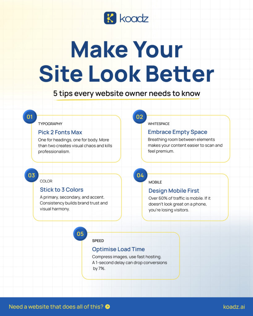
(Infographic titled “Make Your Site Look Better” showing five website design tips: limit fonts, use whitespace, stick to three colors, design mobile-first, and optimize load speed)
A small, consistent palette works better than trying to use too many colors at once. It helps the site feel stable. Mobile experience matters more than most expect. A large share of users come from phones, and if the layout feels off there, they don’t stay. Then there is speed. Even small delays affect how people interact with the page. A slow load is often enough for someone to leave before engaging. All of this helps. But it does not fully solve the problem.
Why Basics Alone Are Not Enough
It is possible to get all of these right and still end up with a site that does not perform. That is because these are individual elements. What actually matters is how everything works together. A website is not just something to look at. It needs to lead somewhere. Without a clear flow, even a well-designed page can feel unclear.
Design Needs Structure to Work
Structure is what gives direction to design. Hierarchy decides what gets noticed first. Larger elements naturally draw attention, while smaller ones support them. When everything is treated the same, nothing feels important. Size differences make content easier to follow. Headings, subheadings, and body text need to be clearly separated so users can move through the page without effort.
Spacing helps organize everything. It creates sections and makes transitions between ideas smoother. When spacing is inconsistent, the page starts to feel slightly off, even if the user cannot explain why. This ties back to a more fundamental idea explored in Why grids should come first in design. Structure is not an afterthought. It is the base. People do not actively think about these details. They respond to them. They follow patterns. When those patterns are clear, navigation feels natural.
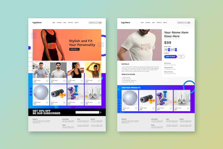
(Two website page mockups side by side showing a product listing page and a product detail page, demonstrating structured layout and visual hierarchy)
A Shift in Approach
Most websites are built by focusing on how they look first. A better approach is to think about how they work. The goal is not just to make something visually appealing, but to make it easy to understand and act on.
How Koadz Approaches This
At Koadz, the starting point is structure. The focus is on what a user sees first, what they understand in the first few seconds, and what they are expected to do next. Each section is placed with intent, not just for layout. Once that is clear, design is layered on top. It supports the structure instead of trying to carry the entire experience. This is what makes the final output feel different. Not necessarily more complex, but more direct and easier to navigate.
Conclusion
If a website feels slightly off, the issue is rarely just visual. Redesigning without addressing structure usually leads to the same result. It helps to step back and look at how the page is guiding users. What stands out first. What feels secondary. What action is being encouraged. When that becomes clear, everything else starts to fall into place.