

Design advice is usually about how things look. “Use this color.” “Try this font.” “Add more whitespace.” “Center everything.” But users do not care about design. They care about understanding what a business does within seconds.
Good design helps users move. Bad design makes them think. Thinking creates friction. Friction leads to drop-offs. This connects closely to a broader idea discussed in Why Your Website Should Answer Fewer Questions, Not More. The faster something is understood, the better it performs.
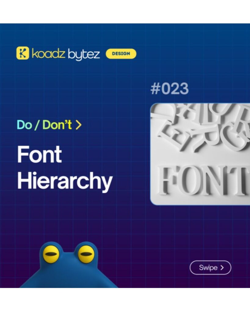
(Graphic titled “Do / Don’t: Font Hierarchy” showing a design tip about using proper text hierarchy in website design)
The Do’s: What Actually Works
Clear headings
Headings should explain exactly what each section is about. No clever phrasing or vague messaging. If someone reads only the headings, they should still understand the page. Descriptive headings consistently outperform creative ones because they reduce effort.
Size contrast
Not everything should be the same size. Important elements need to stand out, while supporting details should remain secondary. Size controls attention and guides the eye. Too many text sizes create confusion. A simple system with heading, subheading, and body text is usually enough.
Reading order
Design should make it obvious what to read first, second, and third. Most layouts follow a top-to-bottom, left-to-right flow. This can be adjusted using size and positioning, but it must remain clear. Users should not have to guess where to look next.
Highlight what matters
Every page has one primary purpose. One main message. One key action. That should be immediately visible. Color, size, and placement should all reinforce what matters most. Good design shows users what matters.
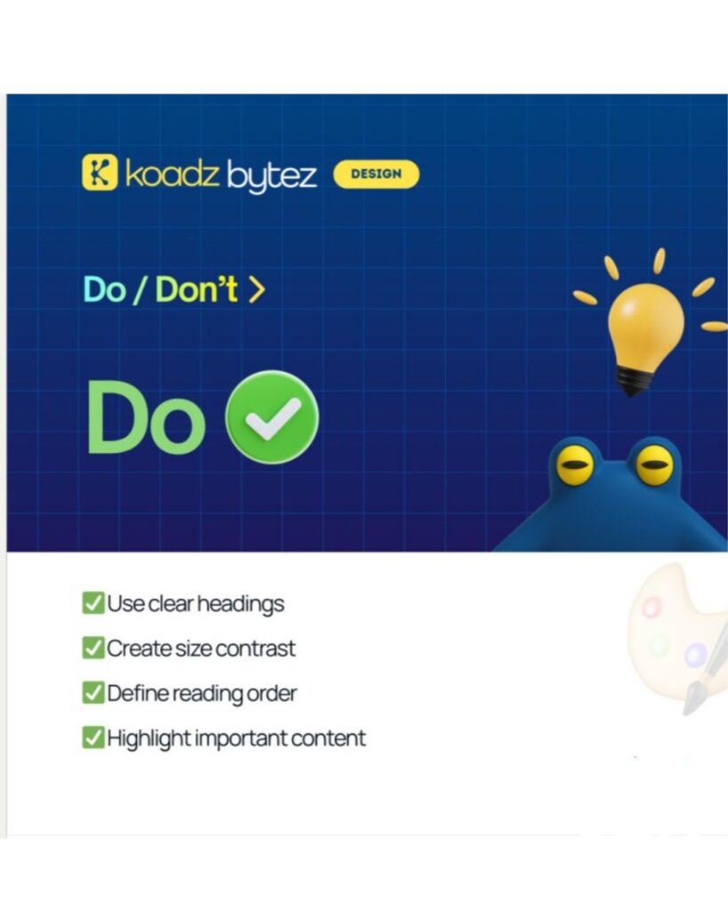
(Graphic showing “Do” design practices with a checklist: use clear headings, create size contrast, define reading order, and highlight important content)
The Don’ts: What Reduces Performance
Same size everywhere
When everything looks equal, nothing stands out. Users scan the page, fail to find a clear starting point, and leave.
Flat structure
When all information sits at the same level, it feels like noise. Important and supporting content must be separated. Grouping and spacing help create clarity.
Hidden hierarchy
Key information is often buried. Value propositions appear too late. Calls to action are not visible. Important points are lost within the layout. Users should not have to search for what matters.
Forcing full reading
Some websites present content like long articles. Large blocks of text with no clear structure. Users do not read everything. They scan. If understanding requires effort, users disengage. This reinforces the idea explored in Why Speed of Understanding Matters More Than Speed of Loading. Clarity is what keeps users moving.
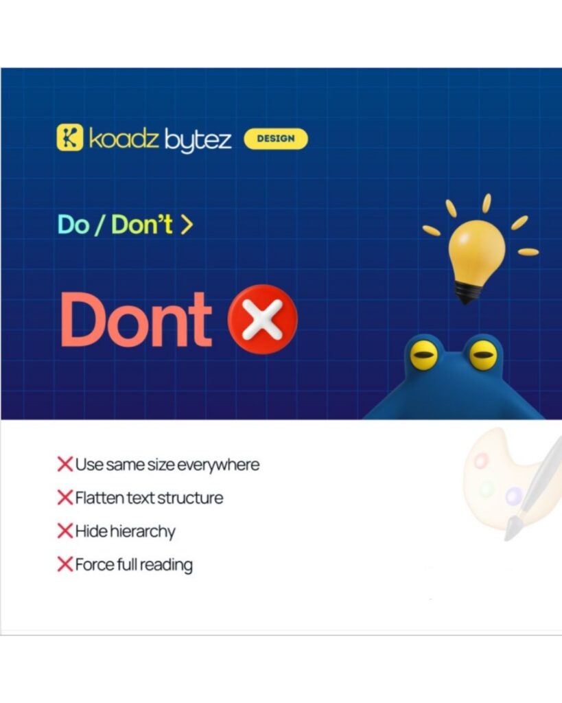
(Graphic showing “Don’t” design practices with a list: avoid using the same text size everywhere, flattening structure, hiding hierarchy, and forcing users to read everything)
User Behavior and Why It Matters
Users scan quickly. Most decisions happen within a few seconds. Attention is limited. When too many options are presented, users hesitate or leave. The role of design is to reduce effort. Every element should either guide the user or be removed. This is also why simpler interfaces outperform complex ones. Clear direction leads to better decisions.
How Koadz Approaches This
Many websites are built like static visuals. They look appealing but do not guide action. Koadz approaches this differently. Websites are treated as flows. Each section has a purpose. Each page leads to the next step. Structure defines movement, and design supports it. A visitor moves through the website with clarity. From understanding to interest to action. Each step feels natural because the structure is intentional. This aligns with the thinking in Why Clean Websites Convert Better Than “Creative” Ones. Clarity consistently outperforms complexity.
The Pattern Across High and Low Performing Sites
Websites that perform well share one thing. Clarity. Websites that underperform share another. Confusion. If users understand what a business does within seconds, they continue. If they do not, they leave. The difference is not visual appeal. It is structure.
What Is Often Missed
When a website does not perform, the first instinct is to redesign it. That is rarely the right first step. The better approach is to evaluate clarity. Can a new visitor understand what the business offers within seconds? Is the main action easy to find? Can it be completed without friction? If the answer is no, the issue is structural. Design does not fix unclear structure. It only makes it more visible.
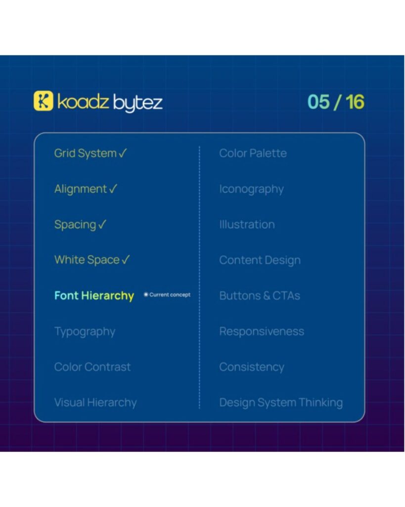
(Design framework graphic highlighting font hierarchy within a system that includes grid, alignment, spacing, and white space as key elements.)
Conclusion
If a website is not performing, it is not primarily a design issue. It is a clarity issue. Users either understand quickly, or they leave. There is little middle ground. Improving clarity should come first. Make the message obvious. Make the next step clear. Reduce effort. Design should support that clarity, not replace it. Once clarity is established, refinement becomes effective.