

Most business homepages fail before anyone reads a word. Not because the design is bad or the copy is weak, but because the person who built it was thinking about what they wanted to say rather than what a stranger needed to understand in the first three seconds of landing there. That distinction, between broadcasting and orienting, is what separates a homepage that converts from one that just exists.
(Homepage landing page design with hero section and call-to-action)
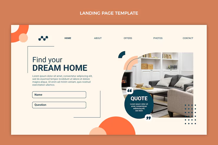
The hero section is doing more work than most people give it credit for
efore a visitor scrolls, before they read a subheading, before they consciously decide whether to stay, they have already formed an impression. This happens fast, faster than feels fair, honestly. The headline they see first either confirms they are in the right place or it does not, and if it does not, nothing below it gets a chance.
This is why vague headlines are such an expensive mistake. “Your success is our mission” and “Elevating businesses through digital innovation” are not headlines, they are the verbal equivalent of filler music in a lift. They say nothing about what the business actually does, and a visitor who cannot quickly understand what they are looking at will leave rather than investigate further. The fix is specificity. A headline that names the service, the audience, or the outcome, ideally more than one of those, gives the visitor something concrete to orient around. It will sound less elegant. It will work better.
The supporting text underneath does not need to be clever either. One or two sentences that add context to the headline, who this is for, what they get from it, why it is different from the alternative, and then a single call-to-action button. One. The instinct to add a secondary option “just in case” is worth resisting. Two options at this stage do not double the conversions. They split the attention and reduce both.
Nobody reads navigation carefully, which is exactly why it has to be obvious
The navigation bar gets looked at rather than read. A visitor scans it in a fraction of a second to build a mental map of the site, and if that map does not form quickly and clearly, they feel slightly disoriented in a way they probably cannot name. That disorientation erodes trust in ways that are hard to measure but very real.
Five or six items is the practical limit before the bar starts to feel cluttered. The labels should be the obvious ones, Services, About, Blog, Contact, not because originality is bad but because originality in navigation creates friction that serves no one. The primary call-to-action belongs in the bar as a button, visually distinct from the links, positioned so that a visitor who is ready to act does not have to go looking.
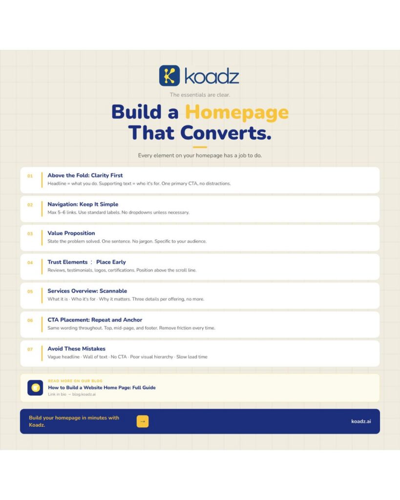
(Homepage design checklist infographic with conversion-focused sections and tips)
The value proposition is not a tagline and should not read like one
There is a section on most homepages, usually just below the hero, that is either the most useful thing on the page or the most forgettable. It is the value proposition, and the version that works is not a brand statement. It is an answer to a practical question: what specific problem does this business solve, and for whom exactly?
The reason so many of these sections fail is that they were written for the business, not the visitor. “We deliver premium end-to-end digital experiences for forward-thinking brands” communicates nothing a visitor can act on. It tells them nothing about whether this business can help with their actual situation. Compare that to something like “We build Shopify stores for independent clothing brands that want to stop losing customers at checkout”, that sentence is less elegant and dramatically more useful. If a prospective client reads the value proposition and cannot immediately tell whether it applies to them, it needs to be rewritten.
Social proof should go near the top, not the bottom
This is the one structural decision that surprises people most often. The common instinct is to earn the reader’s trust through the content first and then present the social proof as a kind of confirmation. That logic sounds reasonable and does not hold up in practice. Visitors who are not yet convinced do not scroll far enough to reach the testimonials at the bottom. The testimonials need to be where the unconvinced visitor still is, which is near the top.
What makes social proof useful is specificity. A testimonial that describes a real outcome, costs reduced, a problem finally resolved, a deadline met after two other agencies missed it, is worth ten times a general compliment. Client logos work as silent endorsements. Certifications and media mentions carry weight even when a visitor does not stop to read them. The presence of these things changes the atmosphere of the page in ways visitors feel without articulating.
The services section is a signpost, not a catalogue
A homepage is not where anyone goes to read a full description of every service a business offers. It is where they go to determine whether any of those services are worth looking at further. These are different tasks and they require different amounts of content.
The services section on a homepage needs to give each offering three things: a name, a one-line description of who it is for, and a clear statement of what it delivers. That covers the decision a visitor needs to make at this stage, which is not “should I buy this” but “is this relevant enough to click through.” Anything beyond those three pieces of information belongs on the dedicated services page. Long descriptions here do not reassure visitors, they delay them.
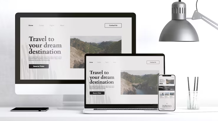
(Responsive homepage design with clear call-to-action across devices)
Three placements for the call-to-action is a minimum, not a maximum
People arrive at readiness at different points on a page. Some visitors read the headline and immediately want to act. Others read the entire page before they feel comfortable doing anything. A homepage with a single CTA at the top serves only the first group. A homepage with consistent placements at the top, mid-page, and in the footer serves both, and every variation in between.
The wording should stay the same across every placement. This sounds like a small thing and genuinely is not. Changing the label from “Book a Free Call” to “Get in Touch” between the hero and the footer introduces a subtle inconsistency that visitors register without being able to explain why the page felt slightly off.
CONCLUSION
Visitors who reach the footer have already done something unusual, they read, or at least scanned, the entire page. They are disproportionately likely to be serious. The footer should contain the contact details, the key page links, the legal information, and a prompt to act. Treating it as leftover space is leaving a conversation unfinished at exactly the moment the other person was ready to respond.
For businesses that want a homepage built around this kind of structure without working through every decision alone, Koadz is designed to handle the layout logic so the focus stays on the content. More on how the homepage fits into a full site in Pages Every Business Website Needs.