

There is a version of this conversation that goes: here is a checklist, add these pages, your site is now complete. That version is not useful because the question is not really about which pages to include. It is about understanding what each page is actually for, what job it is doing, whose needs it is meeting, and how it connects to the others. A website built around a checklist tends to look like one. A website built around an understanding of how visitors move through decisions looks like something else entirely.
The homepage: less than most people put on it, doing more than most people think
The homepage is the navigational centre of a website, which means its primary function is to point, to make it immediately obvious what the business does and where a visitor should go to find out more. It is not the right place for comprehensive service descriptions, detailed credentials, or extended background on the business. Those have their own pages. The homepage points to them.
This matters more than it sounds. A homepage that tries to contain everything ends up being genuinely useful to no one, because it buries the core message under content that should live elsewhere. The visitor who wants to know about services has to scroll through the company history to find them. The visitor who wants contact information finds it after the blog section. Everything is there but nothing is easy to find, and ease of finding is the entire point. For more on how to structure each section, see How to Build a Website Home Page.
The about page and what it is actually being asked to do
When a visitor navigates to the About page, the implicit question they are asking is not “tell me your story.” It is closer to “give me a reason to trust you.” They have already seen the homepage and decided the business might be relevant to them. Now they want to understand who is behind it and whether that person or team is actually equipped to do what they are claiming.
The About page that answers this question well is specific in ways that the typical version is not. It names who the business serves in concrete enough terms that a potential client can recognise themselves. It explains what qualifies the business, not through vague references to experience or quality, but through actual credentials, recognisable clients, measurable outcomes, or specific training. If there is a team, it introduces them with context that is useful to a prospective client rather than just a list of names and titles. The question worth asking when reviewing an About page is: could any competitor write this exact page? If the answer is yes, it is not specific enough.
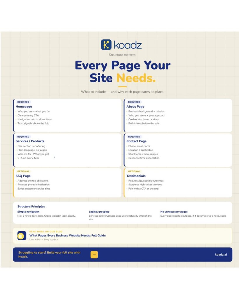
(Infographic of essential business website pages including homepage, services, about, contact, FAQ, and testimonials)
The services or products page: structured for decisions, not for reading
This is the page a prospective client is on when they decide whether to enquire or leave. Everything else on the site is building toward this moment, and the clarity, or lack of it, here determines the outcome. A services page structured for browsing rather than deciding is one of the most common and most costly structural errors in business websites.
The version that works treats each offering as a discrete unit of information: a clear name, a statement of who it is for, and a description of what the client receives or achieves. The language mirrors how the client describes the problem, not how the business describes the solution. That gap between client language and business language is wider than most businesses realise, and services pages that talk across it, using internal terminology, industry jargon, or marketing phrases, create a disconnect that visitors feel immediately even when they cannot articulate why the page did not quite land.
A business with more than four or five distinct services should consider individual pages for each rather than grouping them all together. Forcing a visitor to read past irrelevant offerings to find the one that applies to them adds time and reduces patience in roughly equal measure.
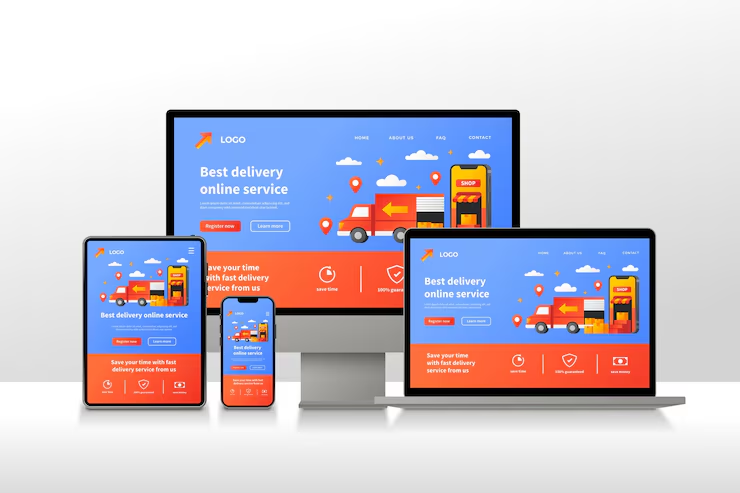
(Responsive website design across desktop, tablet, and mobile devices)
The contact page cannot afford to have friction
At the contact page, a visitor has already decided they want to get in touch. The work of persuasion is done. The only remaining task is not to get in the way of that intention, and yet contact pages manage to do this constantly, through long forms that ask for information the business does not actually need at this stage, through layouts that bury the phone number, through missing details about response times that leave visitors uncertain whether their message will go anywhere.
Phone number and email address should be immediately visible. The form should be short, name, email, message is usually sufficient. Response time expectation belongs here. If location matters to the visitor, because the business is local, or because knowing the geographic base is relevant to the service, it belongs here too. A contact page that clears all of that tends to convert quietly without anyone noticing, which is the right outcome.
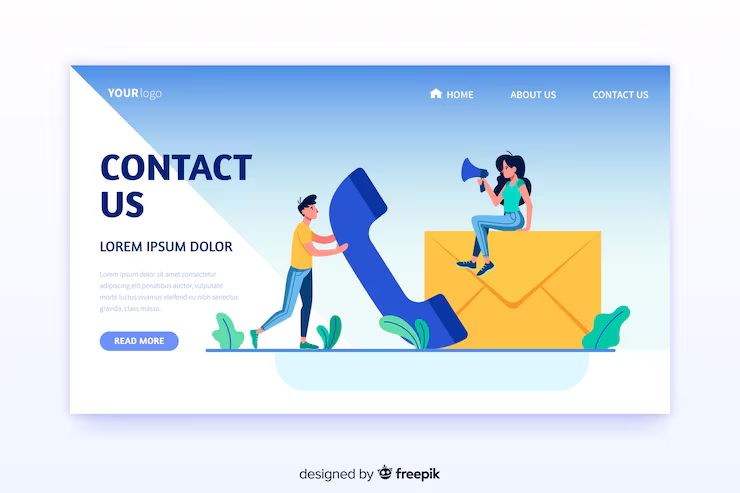
(Contact us page design with phone, email, and message form)
A FAQ page is worth having only when the same questions keep arriving before the sale
This is a page that earns its place rather than being included by default. The businesses where it genuinely helps are the ones where customer service inboxes and pre-sale calls surface the same questions repeatedly, questions about pricing structure, about what is included, about timelines, about what happens if something does not work out. Putting those answers on a dedicated page removes a barrier for the visitor who had the same question and did not want to ask it.
The answers should be written the way the question is actually asked, not the way the business prefers to frame the answer. Visitors reading a FAQ page are in a specific headspace, they have a concern and they want to resolve it. A direct answer in plain language resolves it. A carefully worded paragraph that avoids committing to anything specific does not.
A few pages that some businesses need and others do not
Pricing pages attract better-qualified conversations. Visitors who enquire after seeing the pricing have already self-selected, they have seen the number, decided it is within range, and are now asking for reasons to proceed rather than asking for the number. Not every business should publish pricing, but the ones that can often find that it reduces friction at a stage where friction costs them real leads.
Case studies and testimonial pages do work that homepage testimonials cannot, simply because they have room to be specific. A case study that describes the situation before the engagement, what was done, and what measurably changed gives a prospective client something to evaluate rather than just something to believe. For service businesses selling higher-ticket engagements, this depth often makes the difference between a warm lead and a cold one.
A blog is only worth building when there is both content and consistency to sustain it. An abandoned blog reads as neglect, not as expertise. A regularly updated one that addresses real questions the target audience is searching for compounds in value over time, building search visibility, demonstrating knowledge, and creating repeated points of contact with people who have not yet reached out.
Structure is not just about which pages exist
The connections between pages matter as much as the pages themselves. Navigation should make the important pages reachable within two clicks. Labels should mean what visitors expect them to mean. The sequence in which pages are presented, in navigation, in internal links, in the logical flow of the site, should reflect how visitors actually move through a buying decision rather than how the business thinks about its own offerings.
Adding pages because a competitor has them, or because it seems more comprehensive, typically works against clarity rather than for it. A focused site with six pages that each do their job is more useful than a sprawling one with twelve where half of them do not need to exist.
For businesses that want to get a properly structured site built without starting from a blank page, Koadz handles the architecture side so the content can do its job from the start.