


Any business website’s objective is straightforward: draw in the proper clients, maintain their interest, and motivate them to take action. That is why knowing the common website design mistakes to avoid is important when building a website for your business.
Your website must be clear, simple to use, easy to browse, and enjoyable. Visitors are more likely to remain, explore, and eventually become customers when they can easily grasp what you provide and find what they need.
However, creating a visually appealing website is not the only aspect of good website design.
At Koadz.ai, we believe a good website should function as well as it looks — without requiring you to get buried in complicated code.
Nobody Cares How Beautiful Your Website Is
You might have the most visually stunning website on the internet. But the design is ineffective if users are unable to understand what you do, where to go, or what to do next.
People don’t thoroughly examine every aspect of a website when they visit it. They scan.
As they attempt to respond to a few simple questions, their focus shifts rapidly across the page:
What is this?
Is it relevant to me?
What should I do next?
Everything begins to blur together if nothing is particularly noticeable. Additionally, visitors will just quit a page if it requires too much effort to grasp.
That is why effective website design is more about clarity than embellishment.
Five Elements That Influence Website Performance
A few fundamental design components can have a big impact on how visitors interact with your website. If you’re wondering how to design a user-friendly business website, these five elements are a good place to start.
1. Typography
Typography affects how easily visitors can go through your content and comprehend it.
A page may appear disorganized and challenging to navigate if there are too many fonts used. Generally speaking, a page is considerably easier to scan if you keep its typography basic, possibly using one style for headers and another for body content.
The goal is to make reading simple.
2. Whitespace
Whitespace is often mistaken for wasted space.
It isn’t.
Whitespace gives your content room to breathe. It makes key components stand out and separates different sections.
Think of it as the lung space of your website. Without enough whitespace, everything feels jam-packed.
3. Colour
Color can strengthen your brand, create hierarchy, and draw attention.
However, using too many colors at once can have the opposite effect. A website may begin to appear amateurish or distracting instead of lively.
Generally speaking, a straightforward, unified color scheme works well. Select a few colors and make thoughtful use of them across the website.
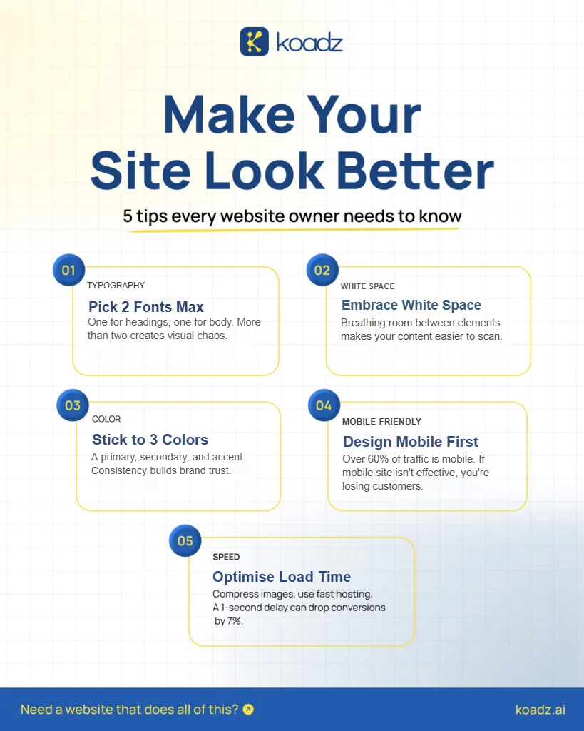
4. Mobile Experience
It is no longer possible to ignore mobile consumers.
Smartphones account for a large percentage of internet traffic. Visitors won’t spend much time figuring out your website if it is hard to read, browse, or engage with on a smaller screen.
Therefore, a mobile-friendly website is not an add-on, but an absolute must.
5. Website Speed
Waiting for a webpage to load might be annoying for most users.
If a website’s pages take too long to load, even well-designed websites may lose visitors. A slow website might cause users to become frustrated, disrupt their journey, and perhaps give up on it completely.
What users perceive is not the only aspect of good design. It also has to do with how fast they can feel it.
Why Getting the Basics Right Isn’t Enough
Even if you have all five of these components in place, your website may still function poorly.
Why?
These are distinct aspects of the experience. How those parts fit together is what matters most.
A website isn’t simply something to look at and admire. It needs to take visitors somewhere.
They should be able to navigate between sections with ease, comprehend what is important, and know what to do next.
Without that flow, even a painstakingly crafted website can feel like a journey without a destination.
Design Needs Structure to Work
Great design without solid structure is like a beautifully painted house built on sand.
Structure is not an afterthought. It serves as the basis.
The structure of a website is not deliberately examined by visitors. They just react to it.
It feels natural to navigate a website when it follows well-known patterns. Visitors automatically know where to look first when there is a clear visual hierarchy.
Size does matter.
While smaller parts can complement larger elements, larger items naturally draw greater attention. Nothing feels significant when everything is given equal visual weight.
For this reason, a clear hierarchy is required for headers, subheadings, body text, buttons, pictures, and other elements.
When your website is well-structured, users can navigate through it without pausing to understand how it works.
A Shift in Approach
A lot of websites are created by asking:
“How should this website look?”
A better question would be:
“How should this website work?”
Making anything aesthetically pleasing is not the only goal. The goal is to produce something that is simple to comprehend, navigate, and take action on.
Once the structure and purpose are clear, visual design can support them.
At that point, design becomes more than decoration.
It turns into a communication tool.
How Koadz Approaches Website Design
Structure is the foundation at Koadz.
The emphasis is on what a visitor sees initially, what they comprehend in the first few seconds, and what they are supposed to accomplish after that.
Each area serves a purpose. Rather than just being positioned on a site to take up space, content is purposefully arranged.
Design is applied on top of a clearly defined structure.
Instead of being expected to carry the entire experience, the colors, typography, space, images, and other visual components assist the structure.
It is not necessary for the outcome to become more complicated.
It must be simpler to use, more straightforward, and easier to comprehend.
Conclusion
Sometimes, a website feels “off” not because of its colours, fonts or graphics, but because the structure isn’t working. Before redesigning, step back and ask: What do visitors notice, understand, and do next? A great website isn’t just about looking good—it makes it easy for customers to understand your business and take action. Ready to build your website? Visit koadz.ai or email info@koadz.ai to get started.