
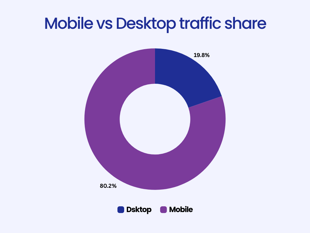
If you’re still designing websites with desktop users in mind first, you’re designing for the minority. More than 65% of global web traffic now comes from mobile devices, and in many industries, that number is well over 80%.
For small businesses, this shift means that a website that doesn’t work perfectly on mobile is effectively invisible. Your customers are searching for you while they’re on the move looking for a service, reading reviews, or checking directions.
Yet, many small business sites still treat mobile as an afterthought. They build desktop-first, then squeeze everything into smaller screens later.
This guide explains why that approach no longer works. You’ll learn what mobile-first design means, why it’s essential in 2026, and how you can build or redesign your website to meet today’s mobile expectations, even without technical skills.
What Is Mobile-First Design?
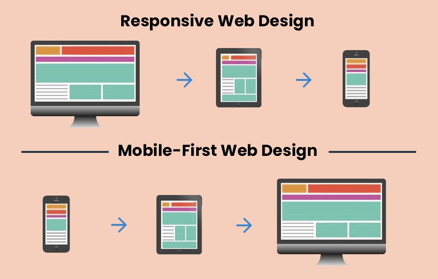
At its core, mobile-first design means building your website starting with the smallest screen, a smartphone, and then expanding upward to larger screens like tablets and desktops.
Traditionally, web designers worked in the opposite direction: they designed for large monitors and later adjusted layouts for smaller devices. The problem is that shrinking content rarely preserves usability. Buttons become tiny, text wraps awkwardly, and layouts feel cramped.
Mobile-first flips that logic. You begin with what’s essential, clear text, readable navigation, and quick access to key actions, and then enhance the experience for larger displays.
Here’s how the two differ:
| Approach | Starting Point | Common Issue |
| Desktop-first | Large screen | Mobile version feels cluttered or broken |
| Mobile-first | Small screen | Scales naturally across all devices |
A mobile-first site is not just “responsive.” Responsive design adjusts to different screen sizes, but mobile-first prioritizes mobile experience above all. Every decision, from layout to image size, starts with how it looks and feels on a phone.

Why Mobile-First Design Matters More Than Ever in 2026
Mobile-first design isn’t a creative preference anymore; it’s a survival requirement for online visibility and customer experience. Here’s why.
1. Mobile Traffic Dominates the Web
Across industries, mobile devices generate the majority of web visits.
In sectors like retail, restaurants, and local services, mobile traffic exceeds 80%.
People use their phones to find nearby businesses, check reviews, and make purchase decisions instantly. For small businesses, this means your website’s first impression almost always happens on a 6-inch screen.
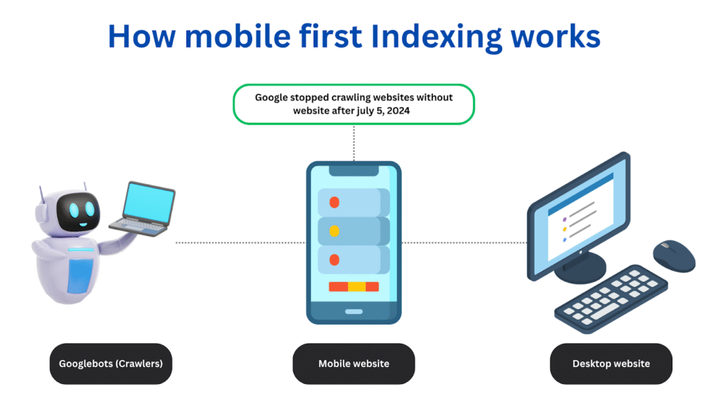
2. Google Uses Mobile-First Indexing
Since 2019, Google has gradually moved all websites to mobile-first indexing, meaning it primarily looks at your site’s mobile version to determine ranking and relevance.
If your mobile site loads slowly, hides important content, or has poor navigation, Google assumes your overall experience is weak — even if your desktop site looks perfect.
Mobile performance directly affects SEO.
A fast, clean, mobile-optimized site is far more likely to rank higher in search results than a complex desktop design that struggles to load on phones.
3. Mobile Experience Drives Conversions
A poor mobile layout doesn’t just cost you ranking; it costs you customers.
When buttons are too small, forms don’t fit, or pages take too long to load, users leave.
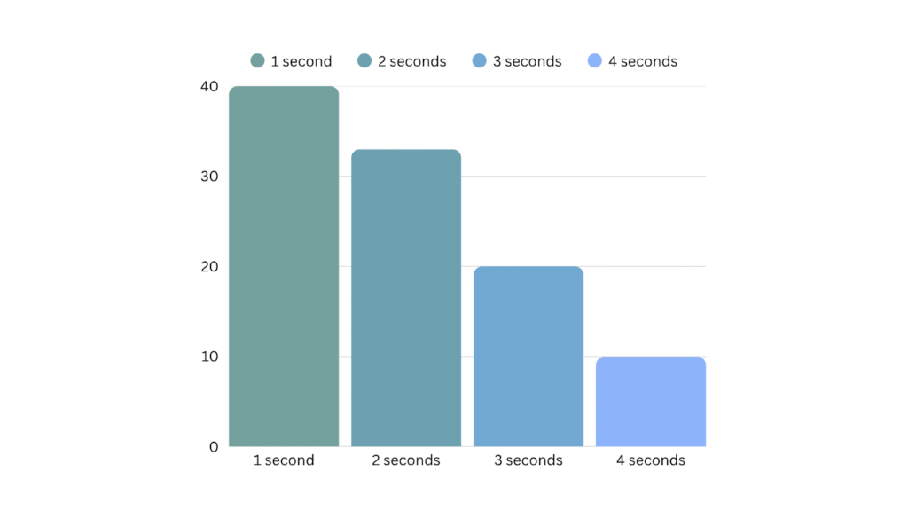
Studies consistently show that even a one-second delay in page loading can reduce conversions by over 7%. For small businesses, that’s often the difference between a customer calling you, or your competitor.
4. User Expectations Have Changed
Mobile-first isn’t only about adapting to devices; it’s about adapting to behavior.
People expect instant access, fast results, and effortless navigation.
They scroll vertically, not horizontally. They use thumbs, not mice. They expect large text, clean layouts, and clear buttons. A modern mobile experience is minimal, fast, and intuitive, not just “responsive.”
How to Create a Mobile-First Website (Even Without Technical Skills)
The good news is that mobile-first design doesn’t require deep technical knowledge. With a bit of planning, anyone can apply the same principles used by professional designers.
Here’s a step-by-step process.
Step 1: Start with Content Hierarchy
Ask yourself: What does a visitor absolutely need to see first on a mobile screen?
Most users care about:
- Who you are
- What you offer
- How to contact you
Focus on those first.
Avoid unnecessary banners, carousels, or large headers. Keep text short and scannable. Every additional element competes with your primary goal: getting visitors to act.
Example content hierarchy for a service-based website:
- Logo + navigation icon
- Headline that explains what you do
- Call-to-action (e.g., “Book a Consultation”)
- Short description or services section
- Contact or form

Step 2: Choose a Mobile-Friendly Template
Your template defines the structure and style of your site. Choose one built for mobile-first design.
Good templates feature:
- Vertical layouts (scroll-friendly)
- Simple navigation menus
- Ample whitespace
- Flexible image blocks that resize gracefully
Modern no-code builders like Koadz use mobile-first templates by default. That means every page automatically adjusts for smaller screens without extra work.
Step 3: Simplify Navigation
On mobile, space is limited.
Keep your navigation minimal (ideally 4–5 key links)
Use clear labels like Home, About, Services, Contact, Book Now.
A hamburger menu (three-line icon) or sticky bottom bar works best for mobile.
Make sure navigation items are easy to tap and don’t overlap with your logo or content.
Step 4: Use Readable Fonts and Tap-Friendly Buttons
Typography and touch targets are the backbone of usability.
- Use at least 16px font size for body text.
- Keep line spacing loose for readability.
- Avoid fonts that are too decorative or narrow.
Buttons should be large enough to tap easily, at least 44×44 pixels. Leave sufficient spacing between them to prevent accidental clicks.
Step 5: Optimize Images and Speed
Large images are one of the biggest causes of slow mobile performance.
- Compress images before uploading.
- Use modern formats like WebP.
- Avoid full-screen hero videos unless they load asynchronously.
A good benchmark: your website should load in under 3 seconds on mobile data.
If it doesn’t, simplify the design until it does.
Step 6: Test Across Devices
Once your site looks good on one phone, test it on others.
Different devices, browsers, and screen ratios can affect how elements appear.
Useful free tools:
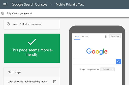
- Google’s Mobile-Friendly Test
- Chrome DevTools (Device Mode)
- BrowserStack (for cross-device previews)
Check every key element, menus, buttons, forms, pop-ups on both Android and iOS.
Common Mistakes in Mobile Website Design
Even with good tools, it’s easy to make design decisions that hurt usability. Avoid these frequent pitfalls:
- Designing for desktop first and then trying to shrink content.
- Overcrowding the homepage with text and visuals.
- Ignoring image compression, which slows down load time.
- Using small buttons or thin fonts that are hard to tap.
- Failing to test forms or CTAs on different devices.
A clean, straightforward layout almost always performs better than an elaborate one.
How Mobile-First Design Improves SEO and Business Results
A mobile-first website benefits not only users but also your business performance.
1. Higher Search Rankings
Google rewards fast, mobile-friendly sites. Even subtle improvements in load time and usability can boost your position in search results.
2. Better User Engagement
When a site loads quickly and is easy to use, visitors stay longer, explore more, and are more likely to convert.
3. Improved Accessibility
A well-designed mobile layout is often more accessible to users with limited vision or motor skills like an additional signal of quality and trust.
4. Local Search Advantage
For small businesses, mobile optimization plays a huge role in local SEO.
Google often displays mobile-friendly sites higher in “near me” searches, helping you reach customers who are actively nearby.
The Simplicity Advantage
Designing for mobile-first isn’t just about accommodating smaller screens, it’s about prioritizing clarity and simplicity.
When you design for mobile, you’re forced to make decisions about what truly matters:
- Which message is most important?
- What should the user do first?
- What information is essential to see immediately?
This discipline naturally leads to better design across all platforms.
Desktop visitors benefit too, because a mobile-first website feels focused, direct, and fast.
How No-Code Tools Simplify Mobile-First Design
You don’t need coding skills or a design background to build a mobile-optimized site anymore.
Modern no-code platforms handle responsive design automatically.
Tools like Koadz let users select mobile-first templates, add content visually, and preview how the site appears across devices in real time. You can adjust spacing, text, and layout directly, no developer intervention required.
For small businesses with limited resources, this is a game changer. It allows owners to stay focused on their work instead of web maintenance.
Conclusion
In 2026, mobile-first design isn’t a design choice, it’s the foundation of good web strategy.
Most customers will never see your desktop site. They’ll meet your brand on their phone, make a decision within seconds, and move on if the experience isn’t seamless.
A mobile-first website ensures they see your business clearly, understand your offering instantly, and can take action easily, whether that means booking an appointment, making a purchase, or getting in touch.
If you’re planning a new website or updating an old one, start by thinking small, literally. Design for the phone first, and everything else will fall into place.