
Colour remains one of the most immediate ways audiences interpret a brand. Research in visual cognition shows that people form initial judgments within 90 seconds, and colour is one of the earliest cues influencing that reaction, though always alongside layout, contrast, and typography.
As branding becomes more intentional and system driven, colour selection is shifting from taste driven choices to strategy led decisions. Today’s creative teams rely on structured palettes, design tokens, and AI assisted system to keep colour consistent across digital and physical touchpoints.
This 2026 framework outlines an evidence informed approach to building a colour system that strengthens recognition, improves usability, and aligns with brand meaning.
1. Emotional & Cognitive Foundation
Colour is processed rapidly by the visual system, which means it can shape expectations before users read a single word. But the emotional impact of colour is contextual, not universal.
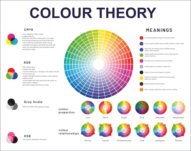
(Core colour theory concepts)
- Red often increases visual salience and physiological arousal in controlled studies.
- Blue is commonly associated with dependability in North American and European markets.
- Green gains much of its meaning from environmental cues such as nature, balance, and sustainability.
- Yellow draws attention due to high luminance contrast in signage and interface elements.
- Black conveys precision and premium positioning, especially in luxury and tech.
A recent study found that brands with coherent design systems, including colour, are perceived as more reliable than brands with inconsistent visual identity.
Key question:
What impression should your brand create during the first moments of visual exposure?
Clarity here sets the foundation for a coherent palette.
2. Align Colour With Brand Behaviour
Colour should reinforce how your brand communicates, operates, and presents itself, not simply how it looks.
(Applying colour intentionally)
Examples from brands using colour intentionally:
- Spotify uses a vivid green that stands out in a category dominated by dark UIs
- Asana uses a soft gradient to represent collaboration and forward motion.
- Monzo Bank’s coral card creates instant physical recognizability within fintech.
- Etsy’s warm orange reflects creativity and craft.
- Nikon uses a stable yellow and black combination to maintain visibility in outdoor and retail settings.

(Brand color, logo of Nikon)
In design research, audiences tend to rate brands as more authentic when colour and tone mirror the personality expressed through copy and product experience.
Guiding prompt:
If your brand had human traits, what colours would naturally express them?
3. Position Yourself Within (or Against) Your Category
Colour plays a major role in competitive differentiation. Some industries reward alignment with norms, while others reward divergence.
(Colour palettes across categories)
- Fintech: Blue dominates for its association with security and clarity.
- Wellness and lifestyle: Muted greens, sage, earth tones, and neutrals signal sustainability and calm.
- Consumer tech: High contrast accents such as coral, lime, and cyan are increasingly used to offset minimalist interfaces.
- Creative tools: Soft gradients and vibrant hues help convey flexibility and experimentation.
(Brand colors of Koadz)
Research from the Nielsen Norman Group shows that colour expectations influence trust and comfort, especially during onboarding. A palette that feels off category can be either a strategic differentiator or a barrier, depending on intent.
Strategic consideration:
Do you want to blend in for trust, or stand out for memorability?
4. Behaviour & Interface Impact
Colour shapes how users navigate digital environments, particularly in moments requiring clarity or action.
Evidence based insights include:
- High contrast CTAs, regardless of colour family, improve visibility and reduce hesitation.
- Consistent accent usage improves task success rates by helping users recognize interactive elements.
- Colour coded states such as success, error, and warning reduce cognitive load and increase comprehension speed.
- Green is effective for confirmation elements because global UI conventions have established it as a “go” signal.
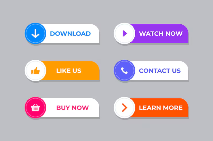
(High-contrast call-to-action buttons)
Recent Baymard Institute usability reviews emphasize that the predictability of colour usage matters more than the colour itself.
With platforms like Koadz, these behaviour driven colour decisions can be systemized across an entire website to avoid inconsistencies that confuse users.
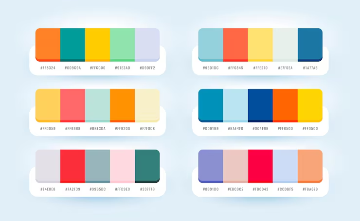
5. Build a Structured, Scalable Palette
Colour psychology has the most impact when supported by a practical system. Modern palettes often include four layers:
- Primary Colour: The anchor used for core brand presence.
- Secondary Colours: Supportive hues for depth and flexibility.
- Accents: Used sparingly to highlight interactive or high value elements.
- Neutrals: Greys, blacks, whites, or creams that create balance and readability.
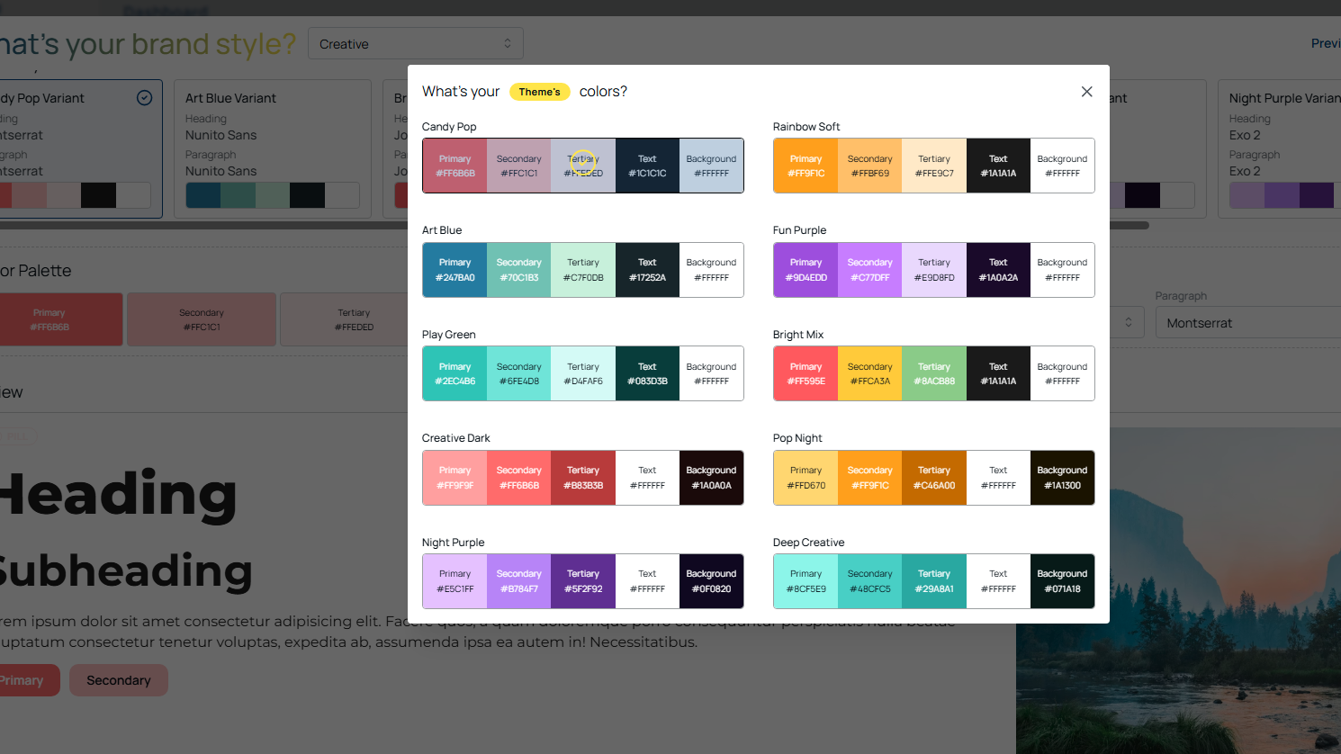
(Structured colour palette system on Koadz)
Design tokens, now standard in many digital systems, ensure that these colours remain stable across websites, apps, and marketing assets. Brands that adopt colour tokens report fewer inconsistencies and faster design to development workflows.
6. Cultural & Audience Considerations
Colour meaning varies across regions, generations, and subcultures:
- White symbolizes purity in many Western markets but mourning in East Asian contexts.
- Red represents warning in Western signage but celebration in China.
- Blue is broadly favored across genders in several global preference studies.
- Neons and gradients tend to resonate strongly with Gen Z digital aesthetics.
- Earthy tones continue to appeal to Millennials for their association with nature and minimalism.
Global brands increasingly maintain regional palette variants, adjusting secondary or accent colours to respect local interpretation without compromising identity.
Conclusion: Colour Is a Strategic Asset
A successful 2025 colour strategy:
- Begins with perceptual and emotional intention.
- Reflects brand behaviour and voice.
- Positions the brand relative to category norms.
- Supports user action through predictable visual cues.
- Operates within a structured, scalable system.
- Respects cultural and generational interpretation.
With design systems and AI tools like Koadz, brands can apply these principles consistently across all touchpoints without manual styling or guesswork.
Consistency builds recognition.
Clarity builds trust.
Together, they shape brands that feel intentional, modern, and memorable.