
For a long time, website performance meant speed.
That was the definition most teams worked from. Load faster. Score higher. Fix what the audit flags. Move on.
I’ve seen teams spend weeks shaving milliseconds off pages. Images get compressed again. Scripts get pushed back. Dashboards improve. Reports look clean.
And yet, visitors still leave.
Not because the page was slow, but because it didn’t explain itself fast enough. A site can load instantly and still fail if someone can’t quickly tell what it’s about, who it’s for, or what they’re supposed to do next. That gap between surface metrics and real behavior is the same one described in How to Measure Experience, Not Just Performance.

(Person sitting at a desk using a laptop, with question marks around the screen)
Fast Pages, Slow Brains
Speed of loading is easy to track.
Speed of understanding isn’t.
People don’t arrive on websites ready to read. They arrive distracted, impatient, and usually skeptical. Within a few seconds, they make a rough judgment about whether this feels relevant.
That judgment isn’t analytical. It’s instinctive.
If the meaning takes effort to decode, the page feels slow anyway. Confusion registers as friction, and friction feels like waiting. This is why performance scores can improve while engagement quietly moves in the opposite direction.
Where the Friction Really Comes From
Most visitors don’t behave the way teams expect them to.
They don’t read top to bottom. They scan. They jump between visual anchors. Headlines, buttons, short phrases that promise clarity without effort.
When everything tries to communicate at once, nothing lands clearly.
Too many ideas blur together. Too many options slow decisions. Vague language forces interpretation instead of recognition. It’s the same dynamic behind why reach often fails to compound into outcomes, something explored in Why Being Findable Matters More Than Being Viral for SaaS Growth.

Person sitting at a desk holding their head while icons, notes, and alerts float around them)
None of this shows up in speed tests.
It only shows up in behavior.
How Confusion Sneaks In
Confusion is rarely obvious.
It builds quietly.
Multiple headlines that all sound important, but don’t quite agree with each other.
Generic claims that could apply to almost any product, leaving visitors unsure whether this is actually meant for them.
Crowded above-the-fold sections filled with features, links, and calls to action pulling attention in different directions.
Buttons that suggest different paths without making it clear which one matters first.
Each moment adds a pause. Enough pauses, and people leave.
What Actually Helps People Understand Faster
Clarity usually comes from restraint.
One clear statement about what the product does and who it’s for gives people orientation. They don’t need the full story immediately. They need to know they’re in the right place.
Visual hierarchy does more work than clever copy. The eye should know where to land first and where to go next without having to think.
Fewer choices reduce pressure. One primary action is usually enough at the start.
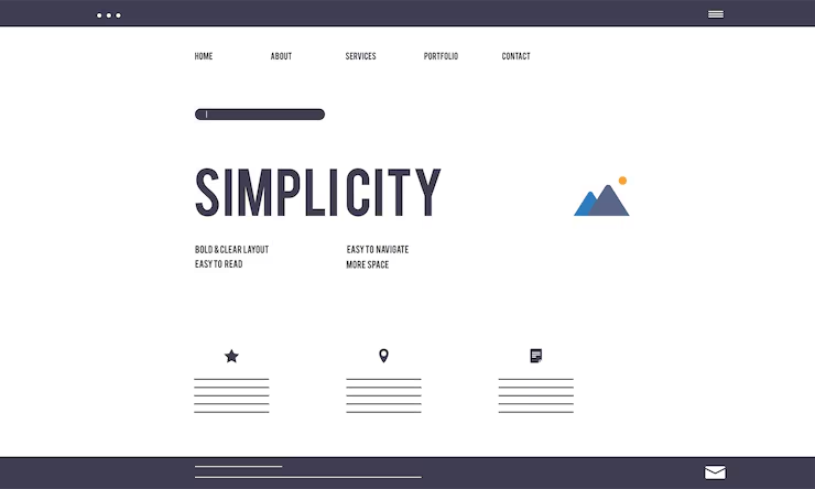
(Illustration of a website layout with a header menu, a large title reading “Simplicity,” and three content sections below)
Pages also work better when they’re built around intent. If someone arrives with a specific question or problem, the page should acknowledge that directly instead of making them hunt for relevance. This is why straightforward clarification often outperforms persuasion, as explained in Why FAQs Often Convert Better Than Your Homepage.
When understanding comes quickly, trust follows.
A Note on How Sites Get Built
This is where tooling quietly shapes outcomes.
Starting from a blank canvas often leads to overload. Everything feels important, so everything stays.
Builders that start with structure tend to avoid this. When layouts force early decisions about message, hierarchy, and flow, clarity becomes part of the foundation. Tools like Koadz push teams in this direction by making intent and structure part of the starting point instead of something fixed later.
Less freedom upfront often saves work later.
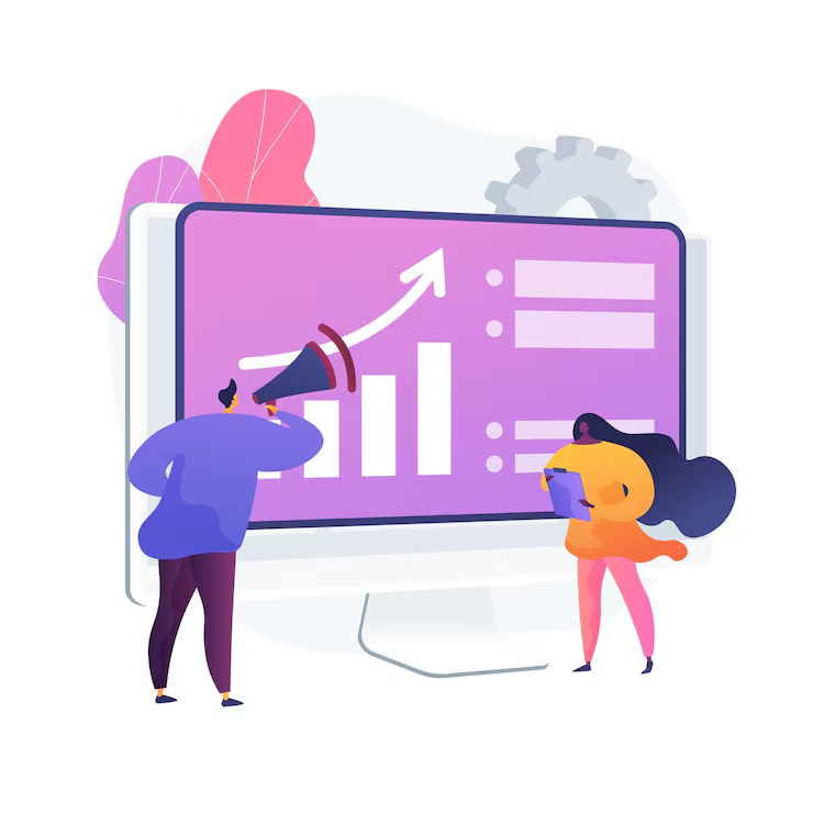
(Two people standing in front of a large screen displaying charts and an upward arrow)
Speed Gets Attention, Understanding Keeps It
Fast load times remove one barrier.
They don’t finish the job.
Speed of understanding decides whether someone stays, scrolls, clicks, or trusts you enough to move forward.
If visitors can quickly tell what you do, whether it’s for them, and what to do next, they’ll forgive a lot. That’s why teams increasingly pair performance work with clarity-first builds, often using platforms like Koadz to reduce friction between idea and execution.
In the end, the most important performance metric isn’t how fast a site loads.
It’s how fast it makes sense.