
A design agency delivered the final files three months ago. The website looks modern. Clean typography, strong visuals, smooth animations. The founder approved every mockup, signed off on every revision. Launch day felt like a win.
Six weeks later, the analytics tell a different story. Traffic exists, but leads don’t. Visitors land, scroll briefly, and leave. The contact form sits untouched. The carefully designed service pages generate zero inquiries. Something is broken, but the designer insists everything works exactly as built.
This is where most businesses start troubleshooting in the wrong direction.
The Misdiagnosis
The first instinct is to blame the design itself. Maybe the colors aren’t right. Maybe the layout feels too corporate, or not corporate enough. Maybe competitors have flashier animations or bolder hero sections. So the business starts collecting feedback, building mood boards, considering a redesign.
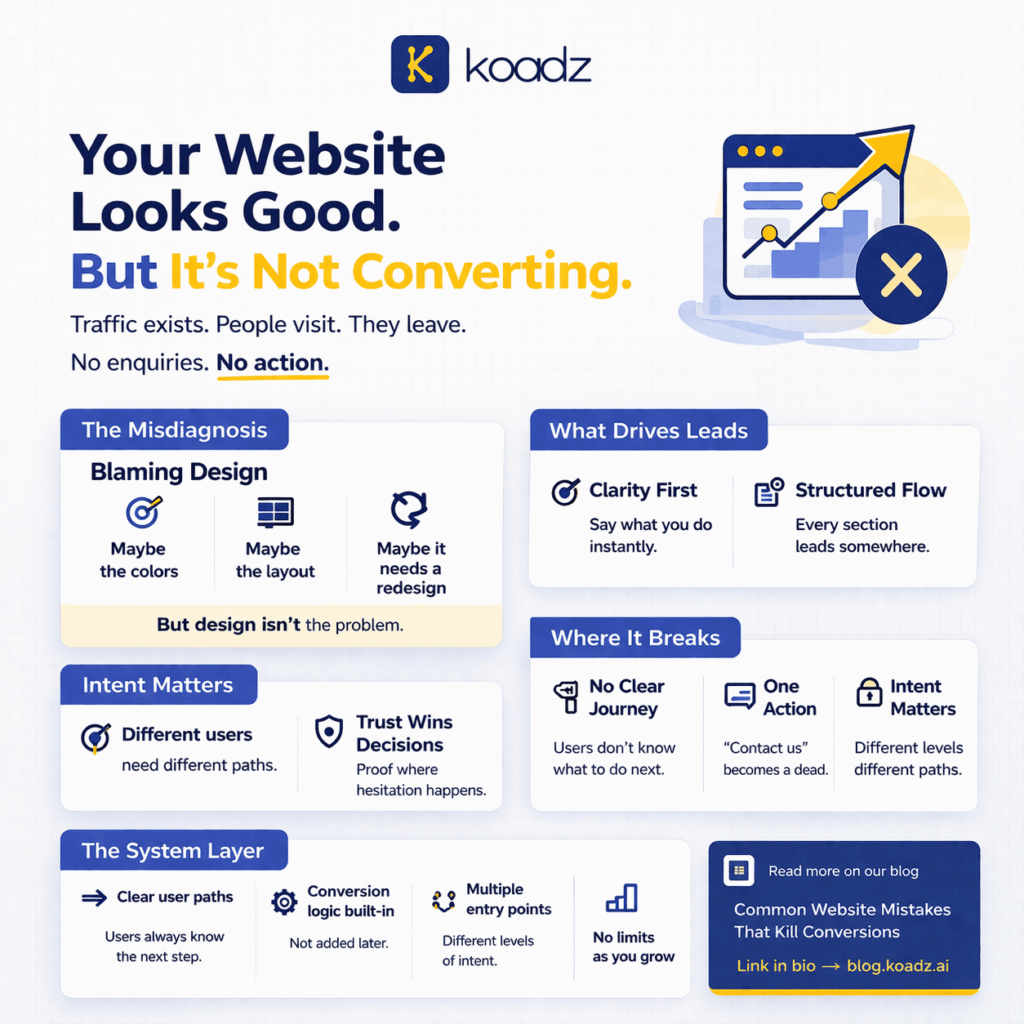
But design is rarely the problem. A website can look exceptional and still fail completely at its actual job. Visual appeal does not create conversions. It supports them, but only when the foundation underneath is sound.
Most businesses confuse aesthetic quality with strategic clarity. They assume that because the site looks professional, it must be working professionally. This assumption costs them months of lost opportunity while they chase surface-level fixes. This pattern is explored further in Common Website Mistakes That Kill Conversions, where surface-level fixes often distract from deeper structural issues.
What’s Actually Happening
Conversions happen when four elements align correctly. None of them are visual.
First is clarity of messaging. A visitor should understand what the business does, who it serves, and why it matters within seconds of landing. Not through exploration or inference, but through immediate, obvious communication. Most websites fail this test. They open with vague taglines, abstract value propositions, or clever wordplay that sounds impressive but communicates nothing concrete.
Second is structured flow. Every page should guide visitors through a logical sequence. From problem recognition to solution understanding to decision confidence. Most websites present information as a menu of options rather than a journey with direction. Visitors are left to assemble their own narrative from scattered pieces.
Third is user intent alignment. Different visitors arrive with different questions, different levels of awareness, different readiness to act. A website must acknowledge this and provide pathways that match where people actually are. Forcing everyone through the same generic experience creates friction at every stage. Some businesses try to solve this by answering everything upfront, but as explained in Why Your Website Should Answer Fewer Questions, Not More, this often overwhelms instead of converting.
Fourth is trust signals. Reviews, certifications, client logos, case studies. These elements need strategic placement, not decorative tucking into footers or buried subpages. Trust is not established through design polish. It is established through evidence, positioned where doubt naturally emerges.
Speed matters too, but not the way most people think. Yes, technical loading time affects bounce rates. But speed of understanding drives conversions. A visitor should grasp the core offer faster than the page loads. As discussed in Why Speed of Understanding Matters More Than Speed of Loading, clarity beats performance when it comes to conversion.
where it breaks
Even when messaging is clear and structure is present, invisible system failures kill conversions.
The most common issue is the absence of a clear journey. A homepage might explain what the business does, a services page might list offerings, a contact page might include a form. But these pages exist as isolated pieces rather than connected stages. There is no intentional path from curiosity to commitment. Visitors who want to move forward have to figure out how on their own.
Lead capture is another critical breaking point. Many websites treat form submissions as the only conversion goal. But not every interested visitor is ready to fill out a contact form. Some need lower-commitment options. A resource download, a quick question answered, a pricing estimate. Without these intermediate steps, businesses lose everyone who is interested but not yet convinced.
Then there are system constraints that reveal themselves only after some initial success. Some platforms cap lead intake. A business might start getting traction, hit a hidden limit, and suddenly find that new submissions are blocked. As highlighted in Free vs Paid Website: When You Should Actually Upgrade, these limits often appear only when growth begins.
These issues are invisible during design reviews. Everything looks complete. Everything functions. But the underlying architecture is not built for conversion or growth.
What Smart Businesses Do Differently
High-performing websites are not designed as collections of pages. They are built as systems.
A system prioritizes clarity over creativity. It uses plain language. It states the problem being solved in terms the audience already uses. It structures information hierarchically, leading with what matters most. Design serves clarity, never competes with it.
A system is designed for conversion at every stage. Not just the contact form, but every point of friction. It anticipates hesitation and addresses it proactively. It creates multiple entry points for different levels of readiness. It removes unnecessary decisions and guides attention deliberately.
A system is structured for scale. It does not break when traffic increases. It does not require manual intervention to handle more leads. It does not impose artificial limits on growth. The infrastructure can support expansion without requiring rebuilds.
Koadz operates as a system builder rather than a template provider. It structures websites around conversion logic, not just visual layouts. It builds clarity into the foundation, handles lead capture without intake caps, and scales as the business grows. Free setups work well for early validation, but businesses serious about growth need systems that remove constraints rather than impose them.
The Real Problem
Websites fail because they are built like brochures instead of systems. They present information without guiding decisions. They look professional without performing professionally. And businesses keep investing in redesigns instead of restructuring.
The solution is not better design. It is better architecture. Structure before aesthetics. Clarity before creativity. Systems before styles.