

The Neuroscience of Attention Decay
Attention spans haven’t just dropped, they’ve become inconsistent in a way that’s harder to design for. You’ll see the 47-second number mentioned a lot, but in practice it doesn’t behave like a fixed limit. Some users leave almost instantly, others stay, but the decision to stay or leave happens very early now. Earlier than most people expect.
We saw this on a landing page for a small retail brand where users were dropping off in under 10 seconds, not because the product was bad, but because nothing meaningful showed up quickly. Once the top section was reworked to communicate value immediately, the drop-off reduced without changing anything deeper in the page. That’s where Why Attention Is the New Currency for Small Businesses in 2026 becomes relevant. Attention isn’t something you hold by default anymore, you earn it in the first few seconds, or you don’t get it at all.

(People using smartphones with social media notifications, representing constant digital engagement and attention competition)
Front-Loading Value and Progressive Disclosure
People don’t really read websites the way they used to. They scan, pause for a second, and then decide. If the value isn’t clear early, they usually don’t go looking for it. That part is obvious once you notice it, but it’s still easy to design pages as if users will patiently move through them.
At the same time, putting everything upfront doesn’t work either. We tried that on a SaaS homepage once, adding more features, more explanations, more sections above the fold. It looked comprehensive, but conversions dropped. It was just too much. That’s where Why Your Website Should Answer Fewer Questions, Not More comes in. Clarity often comes from showing less, not more. Let people pull information as they need it instead of pushing everything at once.
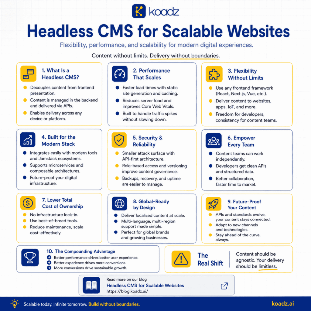
(An infographic explaining how a headless CMS enables scalable, flexible, and high-performance website development)
Micro-Interactions and Immediate Feedback
Users expect some kind of response when they interact with a page. Even small things. A button changes slightly, a form reacts instantly, something confirms that an action worked. When those signals are missing, the page feels slower than it actually is.
There was a checkout flow we looked at where the system was technically fast, but users hesitated because nothing visually confirmed their actions. Adding small feedback cues didn’t change the backend at all, but completion rates improved. It sounds minor, but it isn’t. This is exactly what Why Speed of Understanding Matters More Than Speed of Loading is getting at. People don’t measure performance in milliseconds, they measure it in how quickly things make sense.
Reducing Cognitive Load Through Visual Hierarchy
Cognitive load doesn’t show up as a metric, but you can see it in behavior. When something feels hard to process, users leave sooner. They don’t usually think about why, they just stop engaging.
One common mistake is trying to make everything stand out. Every section bold, every element highlighted. It ends up doing the opposite. Nothing feels important because everything is competing. We saw this on a service page that had strong content, but poor structure. Once the hierarchy was simplified, same content, just clearer flow, engagement improved. That’s where Why Clean Websites Convert Better Than “Creative” Ones fits in. Clean doesn’t mean boring, it means easier to process.
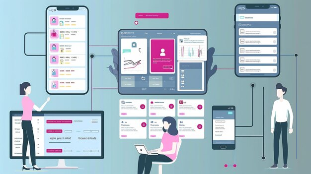
(An illustration of multiple connected app interfaces, showing how users interact with different screens and digital experiences)
The Psychology of Variable Rewards and Gamification
Not all engagement comes from clarity. Some of it comes from unpredictability. People tend to stay longer when there’s a sense that something new might appear, even if they’re not actively thinking about it.
But this is easy to overdo. We’ve seen product pages where everything feels engineered to keep attention, pop-ups, animations, constant movement. It works briefly, then starts to feel overwhelming. A small amount of variation is enough. Beyond that, it becomes distracting. There’s a balance here that’s hard to get right, and once you cross it, it shows.
Mobile-First Design and Thumb-Zone Optimization
Most interaction now happens on mobile, and that changes behavior in subtle ways. People use one hand, they’re often multitasking, attention is divided. Design has to account for that, not just resize itself.
We worked on a page where a key action was placed slightly out of reach in the top corner. It didn’t seem like a big deal until we moved it closer to the natural thumb zone. Engagement improved almost immediately. Not dramatically, but enough to matter. This connects to Mobile-First Design: Why It’s the Only Approach That Works in 2026. Mobile-first isn’t just about layout, it’s about how people physically interact with the screen.
Attention Metrics and Real-User Monitoring
Measuring attention is not as simple as looking at time on page. Someone can leave a tab open and it looks like engagement, even if nothing is happening.
What matters more is behavior. How far people scroll, where they stop, what they interact with. We’ve seen cases where time on page looked healthy, but interaction was almost zero. Once you look deeper, the problem becomes obvious. That’s why How to Measure Experience, Not Just Performance matters. Surface metrics can look fine while the actual experience is not.

(A smartphone showing a map inside a warehouse, representing real-world app usage and context switching between digital and physical tasks)
Designing for Distraction and Context-Switching
Users don’t interact with websites in isolation anymore. They switch between apps, messages, and tasks constantly. Attention gets interrupted whether you plan for it or not.
So the goal shifts a bit. It’s not about forcing focus, that rarely works. It’s about making it easy to return. Saving progress, keeping things scannable, reducing the effort needed to continue. We saw this on a longer form page where breaking content into clearer sections helped users pick up where they left off instead of dropping off completely. It’s a small change, but it makes a difference over time.