The 2026 Guide to Brand Image Consistency Across Your Website
Have you ever landed on a site where the design feels warm and welcoming, yet the copy sounds like it came straight from a compliance handbook?
Or maybe the layout feels bold and energetic, but the text reads like someone wrote it during a power outage and a deadline.
That small mismatch creates friction. People cannot always explain it, but they feel it immediately. Once a visitor senses that disconnect, trust begins to fade.
The good news is that bringing your brand image and your website content into alignment is far simpler than most people think.
Let’s walk through it.
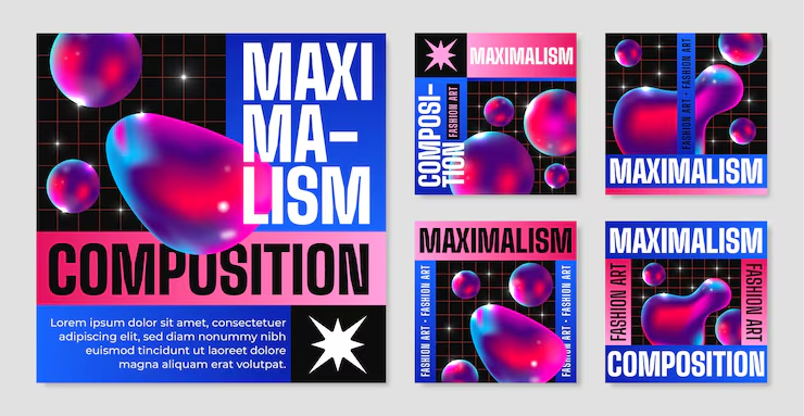
(Visual overview of branding)
1. Begin With a Quick Brand Alignment Self-Test
Forget complicated frameworks for now. Ask yourself one question:
Do your visuals, tone, and layout express the same personality?
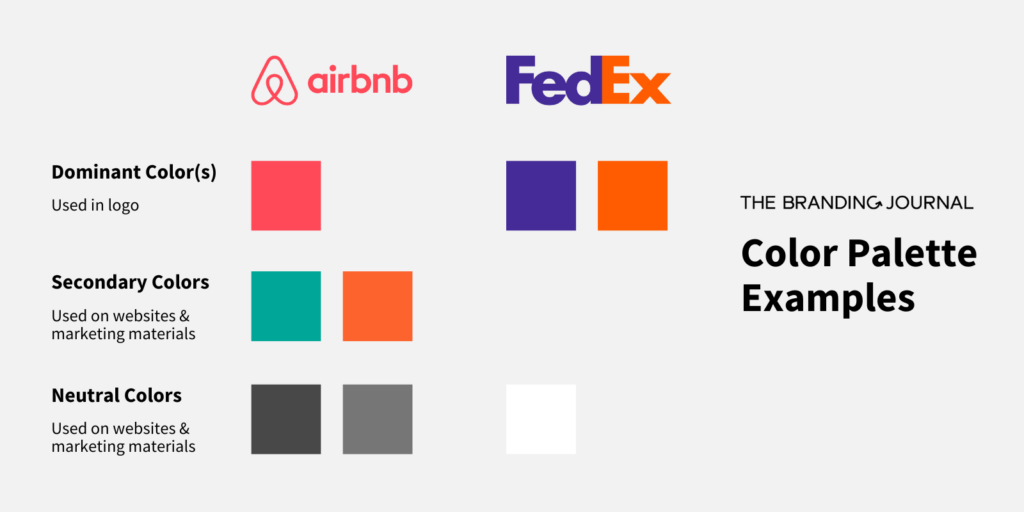
(Example of structured brand color usage of airbnb & FedEx)
Run these quick checks:
1. Place your logo next to a screenshot of your homepage in a design tool. You will see immediately whether the emotional energy aligns.
2. Use a palette extractor like Coolors to pull hues from your logo. If your site colors are completely unrelated, you have identified a core issue.
3. Drop a few paragraphs of your copy into Hemingway or Grammarly. Does the feel of the writing match the feel of your visuals? Soft designs need gentle language. Energetic designs need confident writing.
Think of it like choosing an outfit. Shirt, shoes, and accessories should all reflect the same mood.
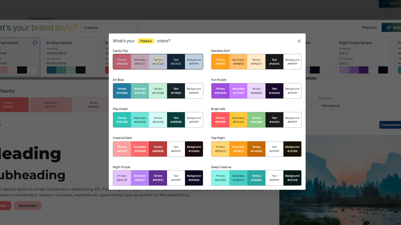
Platforms like Koadzsimplify this step because fonts, colors, and personality settings carry across your entire site without manual correction.
(Centralized brand styles applied site-wide)
2. Establish Visual Repetition That Feels Authentically You
Strong brands repeat recognizable elements such as shapes, textures, or consistent moods.
If you’re building your brand system from scratch, our 2026 brand guidelines guide explains how to structure colours, typography, spacing, and components into a repeatable, scalable identity
This is not a design gimmick. It is how the brain forms familiarity. Patterns help users feel oriented and comfortable.
You can repeat elements like:
a specific curve or angle from your logo
one reliable highlight color
a unified texture or lighting style
a consistent icon or illustration system
a signature geometric motif
a predictable type structure
You do not need bold repetition. You need reliable repetition.
(Core elements of a design system)
This is why design systems from teams like Apple, Asana, and Spotify feel cohesive. Users instantly sense they are still within the same experience.
Tools like Canva, Photopea, and Remove.bg let you maintain a common visual atmosphere without advanced design skills.
3. Keep Colors and Tone Stable Across Every Page
You have probably visited a website that looked promising at first glance, then suddenly felt slightly off. Color inconsistency is often the cause.
The brain reacts to color before it interprets text. If different sections contain:
unrelated blues
mismatched lighting
irregular shadows
unexpected accent colors
conflicting button styles
The overall experience becomes visually noisy even when the words are strong.
One neutral palette such as black, gray, cream, or white
One consistent image mood that stays warm, cool, bright, or soft
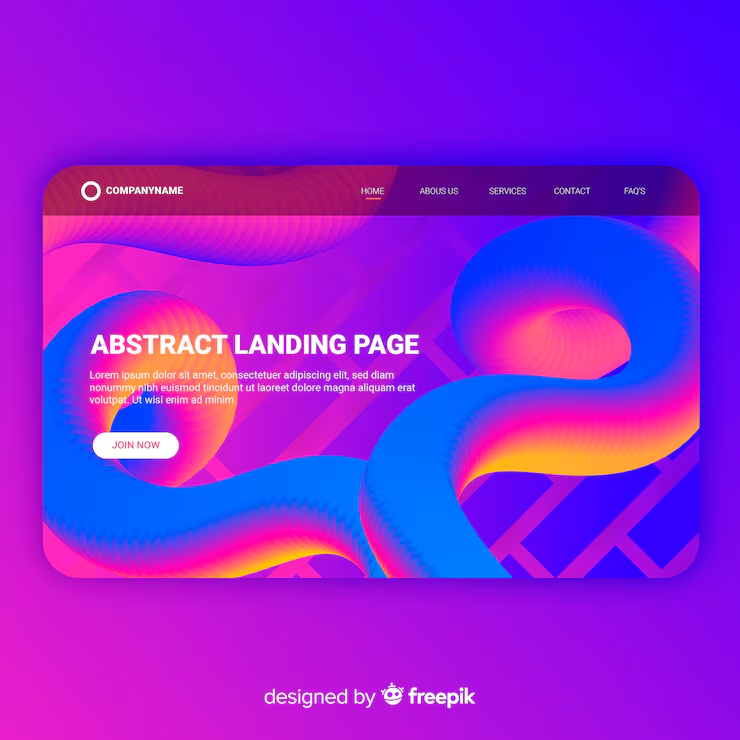
(Consistent visual mood across pages)
Even a subtle overlay used on all images can unify the entire website. Tools like Koadz help maintain this consistency since spacing, color values, and components remain aligned across every page.
4. Treat Your Writing Style as a Brand Signature
Your visuals set expectations and your copy fulfills them.
Your tone should reinforce the traits your visuals communicate:
Friendly brands should avoid rigid or mechanical sentences.
Premium brands benefit from clean and precise language.
High energy brands should use active verbs and concise lines.
Calm brands can use smoother phrasing and relaxed pacing.
Try this exercise:
Look at your hero image for a moment. Ask yourself: If this image had a personality, how would it speak?
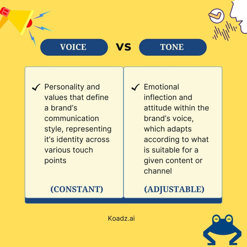
(Brand voice vs tone)
Rewrite your headline using the answer.
If you want to sharpen the personality behind your brand voice, our 2026 personal branding guide walks you through building a clear, memorable identity that carries naturally into your website tone
Tone alignment becomes especially powerful in microcopy such as form notes, tooltip hints, and button labels. These small touches give your brand coherence and intentionality.
5. Revisit, Measure, and Update as Your Brand Evolves
Brand alignment is not a one time task. It develops alongside your business.
Use analytics to observe:
where visitors pause or linger
which visuals attract the most attention
which calls to action receive little engagement
where scrolling speeds up or stops
Heatmaps from Hotjar or Microsoft Clarity show how users emotionally interact with your site.
(User interaction heatmap)
You may discover that a section you expected to succeed is underperforming or that an overlooked area resonates strongly.
If your site is built with a modern tool like Koadz, updates become simple. Adjust your brand settings once and the entire site adapts automatically.
Final Thoughts: Alignment Builds Trust and Trust Drives Results
When design and writing communicate one coherent message, clarity emerges. With clarity comes trust. Trust is what turns a casual visitor into a subscriber, a client, or a customer.
You do not need a large branding team to achieve this. You need intention, consistency, and a willingness to refine steadily.
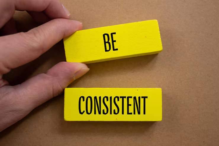
(Consistency compounds over time)
Start with one page. Match one headline to one image. Fix one tone mismatch.
Small improvements add up. Soon your website will not only resemble your brand. It will express your brand.
Illustrations and visual assets sourced from Freepik.