
Minimalism in web design is often misunderstood as a visual trend. In reality, it is a direct response to how people behave online today. Attention is limited, patience is thinner than ever, and users make decisions quickly. This shift mirrors the dynamics explored in Why Attention Is the New Currency for Small Businesses in 2026, where visibility alone is not enough. What matters is how efficiently attention is held once it is earned.
Websites that respect this reality perform better. They reduce friction, lower cognitive effort, and allow content to do the heavy lifting. Platforms like Koadz are built with this mindset, focusing on clarity, speed, and intentional structure rather than unnecessary complexity.

(Minimal website design displayed on a clean workspace highlighting clarity and focus)
Users Skim. They Do Not Explore.
Most people do not browse websites. They arrive with intent, skim for confirmation, and decide what to do within seconds.
Eye tracking research shows that users scan pages quickly, focusing on the top portion first and then moving downward while paying attention to headlines, buttons, and visually distinct elements. Long paragraphs and decorative sections are often ignored.
This pattern is visible across nearly every successful digital product.
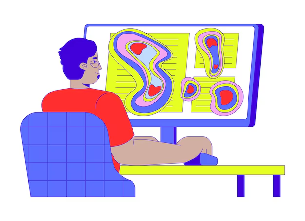
(Eye tracking heatmap showing how users skim website content instead of reading fully)
Google Search presents a single action and removes everything else.
Stripe applies the same principle to a complex product by making value immediately visible while keeping details optional.
Minimalism works because it aligns with how users actually behave. It respects limited attention instead of competing for it.
Cognitive Load and Decision Fatigue Explained Simply
Cognitive load is the mental effort required to process information. Every additional option, visual element, or interaction increases that effort.
Decision fatigue occurs when users are asked to choose too much. This directly reflects the behavior described in The Psychology Behind “I’ll Do It Later” and Why It Quietly Kills Momentum. When users feel overwhelmed, they postpone decisions or abandon them entirely.
A navigation menu with ten options forces users to stop and think. A focused menu with three clear paths allows users to move forward instinctively.

(Illustration of a of cluttered website layout)
Shopify learned this through years of checkout optimization. By removing unnecessary steps and simplifying layout, Shopify improved completion rates not through persuasion, but by reducing mental strain.
Minimalist design works because it removes the need to think. When thinking is reduced, action increases.
Expressive Design vs Functional Clarity
Expressive design emphasizes creativity. Bold colors, animations, and unconventional layouts are often used to create emotional impact. This approach can be powerful when aligned with brand intent, as explored in The Psychology of Colour in Branding: A 2026 Evidence-Based Framework.
Functional clarity prioritizes usability. Clear hierarchy, predictable navigation, readable typography, and intentional spacing help users understand what to do next without hesitation.
Problems arise when expression overrides clarity.
(Expressive website design contrasted with a functional and user focused layout)
Many visually striking websites struggle to convert because users cannot quickly understand what the site offers. Creativity becomes friction when it delays comprehension.
The strongest products balance both.
Notion demonstrates this balance well. Its interface is restrained, consistent, and calm, reinforcing principles outlined in The 2026 Guide to Brand Image Consistency Across Your Website.
Minimalism does not remove personality. It refines it so branding supports usability rather than distracting from it.
Clean Layouts Reduce Friction and Speed Up Decisions
Friction is anything that slows users down. Confusing layouts, unclear calls to action, unnecessary steps, slow load times, or overlapping UI elements all reduce momentum.
Clean layouts reduce friction by guiding attention naturally. Whitespace separates ideas. Typography improves scanning. Clear calls to action reduce hesitation.
This principle directly supports Mobile-First Design: Why It’s the Only Approach That Works in 2025. On smaller screens, minimalism is not optional. It is essential.
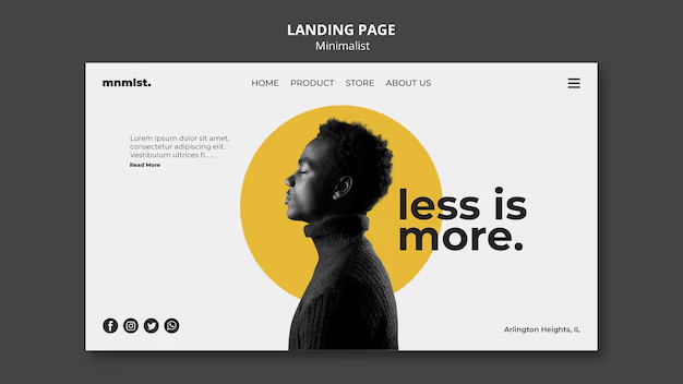
(Clean landing page design with clear call to action and minimal distractions)
Performance data supports this. Users abandon slow sites quickly, especially on mobile. Minimal layouts tend to load faster because they rely on fewer assets and simpler structures.
Tools That Support Minimalist Execution
- Hotjar and Microsoft Clarity reveal where users hesitate or disengage
- Google PageSpeed Insights and Lighthouse highlight performance issues
- Figma and structured design systems enforce consistency
Within the Koadz website builder, these principles are reinforced through intentionally lightweight tooling.
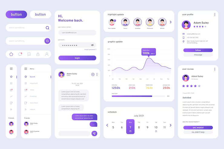
(Clean website builder interface showing lightweight components and modular design)
Instead of stacking multiple external plugins that introduce redundancy and performance drag, Subtel Koadz Plugin keeps functionality centralized, efficient, and aligned with minimalist design goals. The result is cleaner interfaces, faster load times, and fewer hidden points of friction.
This approach reflects broader trends discussed in Best AI Website Builders in 2025, where simplicity and performance increasingly define quality.
Good Design Disappears and Lets Content Do the Work
The most effective design is invisible.
When a website is well designed, users do not notice layout choices or interface mechanics. They notice how easy everything feels. They remember the message, the product, or the outcome.
This is especially relevant in an era explored in Is Blogging Dead in 2026? Or Has Its Role Quietly Changed?. Content still matters deeply, but only when design allows it to be consumed effortlessly.
(User engaging with a simple website where content is clear and easy to navigate)
Minimalism enables content to lead. It builds trust, reduces hesitation, and accelerates decisions.
Great design does not demand attention. It supports intention.
Final Thought
Minimalism in web design is not about removing elements for aesthetic reasons. It is about removing anything that does not help users move forward.
By designing for skimming behavior, reducing cognitive load, prioritizing functional clarity, and eliminating friction, businesses create experiences that feel confident and effortless.
When design disappears, value becomes obvious. And that is when content truly does the work
Image credits : Freepik