

The majority of companies approach website development incorrectly. They consider the appearance first, then the substance, and only then do they consider the overall plan. By the time the website is ready, it may be visually stunning, but it may not actually do what the business needs it to do.
A website is more than simply a digital brochure. It should assist visitors become customers. And for that to happen, a few critical decisions must be made before you begin developing anything.
The best websites typically start with a few simple questions: Who are we constructing it for? What do we want the visitors to do? What may prevent them from doing it? And what information would they need to make that decision?
Once you have clear answers to these concerns, everything else—from the content and layout to the design—begins to come together. Without clarity, even a beautifully designed website may struggle to provide results. If you’re considering creating a website for your business without a developer, getting these basics right becomes more important than ever.
In our previous blog, https://blog.koadz.ai/2026/09/30/your-domain-your-website/, we explored the components of a domain name, the importance of having a custom domain and the points to keep in mind before choosing the right domain name.
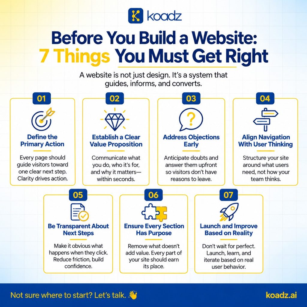
1. Define the Primary Action
Your website should have a clear goal, such as booking a call, starting a free trial, purchasing something, or contacting you. This is the first step you need to accomplish when learning how to build a website for your business. Without a clear goal, it can become a collection of information without a clear direction, leading visitors to quit without taking any action.
One common mistake businesses make is trying to make everything equally important. The homepage might have a “Book a Demo” button, a free trial, a downloadable guide, and a contact form—all fighting for attention. When everything is portrayed as the major action, visitors may question, “What am I actually supposed to do here?”
Instead, your website should gently guide visitors to the most appropriate action for them. Your content, site structure, and calls to action should all work together to make the next step clear.
Knowing your main goal also makes it much easier to determine what information your website needs. For example, if you want people to subscribe at a meagre sum of just Rs. 10, you should address any concerns they may have. What does the subscription include? How long does it last? Do they need to pay more later? What is the next goal once the subscription ends?
These may seem like minor details, but they can make a significant difference. The less unanswered questions visitors have, the easier it is for them to take the following steps.
2. Establish a Clear Value Proposition
A value proposition is not the same as a tagline or mission statement. It should simply state three things: what your company does, who it serves, and what they can expect to get from it.
And it should be easy to understand in a matter of seconds. If someone has to read it twice or browse the website to figure out what you’re offering, it needs to be improved.
This is where many businesses get stuck. They strive to express everything at once. They aim to cover every feature, industry, and benefit in the opening message. The issue is that when you try to express too much, the message frequently gets ambiguous and general. Visitors read it but are still curious, “Okay, but what exactly do you do?”
The solution is to start with one clear, important idea. That doesn’t mean you have to ignore anything else. Begin with the most important information you want readers to know, and then expand on it throughout the website.
Ideally, someone should be able to read your headline and first paragraph and instantly understand what you’re offering and whether it’s relevant to them. If consumers have to read through numerous sections to find out, your value proposition isn’t effective.
3. Objections Need Proactive Addressing
Before deciding to buy from you, customers may have certain doubts. Is it too pricey? Will it be hard to use? Is it actually suitable for them? Can people trust the company to deliver on its promises?
A smart website should aim to address these questions before visitors ask them. Rather than waiting for potential consumers to express their issues during a call or conversation, your website can address them with the right information and messaging.
For example, if individuals are unsure whether your product is suited for them, offer them real-life use cases or customer examples. If they are concerned that it will be too complicated, explain how it works in simple words or show them a quick demonstration. If they are unsure whether they can trust you, provide proof—customer testimonials, case studies, transparent pricing, or an honest look at how your business works.
One common mistake is assuming that interested visitors will just reach out and ask questions. Most will not. If they cannot find the answers they need, they will most likely leave and look elsewhere.
Your website should make it simple for visitors to determine whether your product or service is a good fit for them. The more questions you can answer up front, the easier it will be for the right clients to take the next step.
4. Align Navigation With User Thinking
Many websites organise their navigation around the way the business itself is organised. There might be one page for each product, another for each service, and separate sections for different departments.
However, visitors do not perceive your business in this way. They aren’t interested in your organizational structure. They are mainly focused about one thing: “Can this business solve my problem?”
Your website’s navigation should make it easy for them to locate answers to their specific questions. For example, a visitor to a software website may wish to know: Will this work for my team? How much does it cost? Can it replace the tool I am now using? If getting these answers requires too much effort, visitors may rapidly lose interest.
This does not mean you should remove your product pages or service descriptions. Instead, ensure that visitors can get the information they need depending on what they are looking for, not based on how your company is organized.
People should not have to figure out which department handles their problem or which product category they fit into. Your website should simplify the journey and allow visitors to pick the path that is most appropriate for them.
5. Pricing and Next Steps Require Transparency
Hiding your pricing doesn’t necessarily result in extra sales possibilities. In fact, it can arouse suspicion. When visitors cannot locate pricing information, they may begin to question, “Is it too expensive?” or “Why aren’t they telling me the price?”
Of course, not every business can set a fixed pricing. It is completely alright to base your pricing on the customer’s needs or the level of customization. You can still give clients a starting price, a general range, or some example packages. Even a little information is better than making people guess.
Transparency isn’t just about pricing. It also applies to all buttons and calls to action on your website. What happens when someone selects a button labeled “Get Started?” Do they fill up a form, start a free trial, or schedule a demonstration? Similarly, if the button says “Contact Us,” will someone call them, send an email, or simply receive their enquiry?
These things may appear minor, but they are important. When people know what will happen next, they are more likely to take action.
A good website doesn’t make visitors guess. It explains what to expect at each step. The more uncertainty you remove, the more confident individuals are in moving forward.

6. Every Section Must Serve a Clear Purpose
Each area on your website should have a purpose. It should either help visitors understand something, answer a query, clear up a misunderstanding, or push them closer to taking action.
The problem is that many websites include sections solely because they are deemed “standard.” Take the “About Us” page as an example. It’s there because practically every website has one, not because it helps the user make a choice.
A simple way to evaluate each section is to ask, “What does this help the visitor decide?” If you are unable to provide a clear answer, you may want to revisit that area.
More content does not necessarily make a website better. In fact, too much information can make it more difficult for visitors to find what they are looking for. A shorter, more focused website can frequently be more effective since it simplifies things and allows visitors to make decisions without feeling overwhelmed.
7. Launch and Improve Based on Actual Behaviour
One of the most common mistakes businesses make is waiting until their website is flawless before launching it. They spend weeks fine-tuning the text, moving things around, changing colors, and discussing minor design issues, all while potential clients are already looking for answers.
Your website does not need to be great from the start. It must be clear, useful, functional, and live. You can always make improvements once real people start using it. This is why knowing how to plan a website before building it is beneficial, as is being willing to improve it once visitors start using it.
And that is the most crucial element. You can spend hours debating if a specific headline would work, or you can test it out and see what people do. Real visitors will tell you far more than any internal conversation can.
Analytics can show you which sections people are looking at, which buttons they click, and where they depart the site. You may then utilize that information to create improvements based on what is actually happening, rather than what you expect to happen.
So, instead of waiting for the “perfect” website, launch a good one, learn from your visitors, and keep improving.
Conclusion
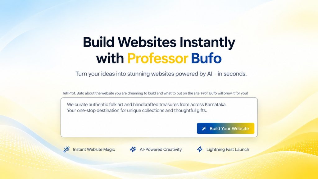
Koadz makes this approach much easier by allowing businesses to build and launch a website in minutes. But launching quickly doesn’t mean putting out something half-baked or poorly thought out. The idea is to get a clear, functional website online without spending weeks waiting for every little detail to be perfect. Ready to build your website? Visit koadz.ai or email info@koadz.ai to get started.